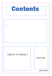
I started of by creating a flatplan of a front cover for my college magazine. I sketched out the person who would be on the front cover and put in the title and all of the contents. We then went around the college looking for places where we could take the photo for the front cover.We took a few so we could show which would be good and which wouldnt. After we went onto Adobe InDesign and started to make the front cover.
 This is the bad photo beacuse it shows me posing instead of smiling. also i kind of have my body turned, turning away from the camera, and the background is not the best for a college magazien front cover.
This is the good image to use for my front cover, because it shows her smiling and facing towards the camera. Also shows a good background of apart of the college.
 This is the bad photo beacuse it shows me posing instead of smiling. also i kind of have my body turned, turning away from the camera, and the background is not the best for a college magazien front cover.
This is my front cover for my college magazine. i designed it on Adobe InDesign, i named it Inside College. i put a picture of someone on front cover liek i informed i would. and it follows my flat plan just write, it has all the writting i put on the flatplan. I made my title font how it is because its easy to read and it has an effect which will draw more students to it. I used colour blue for teh writting on the page so it stands out more and is easier to read.

This is my Contents page for my college magazine. I used the colour blue and this font for my title so its would stand out more, and same reason for the size font.
The first box under the title is about welcoming the students to teh college and telling them about it. also about the magazine and what it includes.
Under that to the left is a place for a picture of the college, perhaps main entrance of the college, or the whole bulding from far away. to the right is just more writting on extra stuff about the magazine and what people need to know about the college.
At the very bottom are the page numbers.

